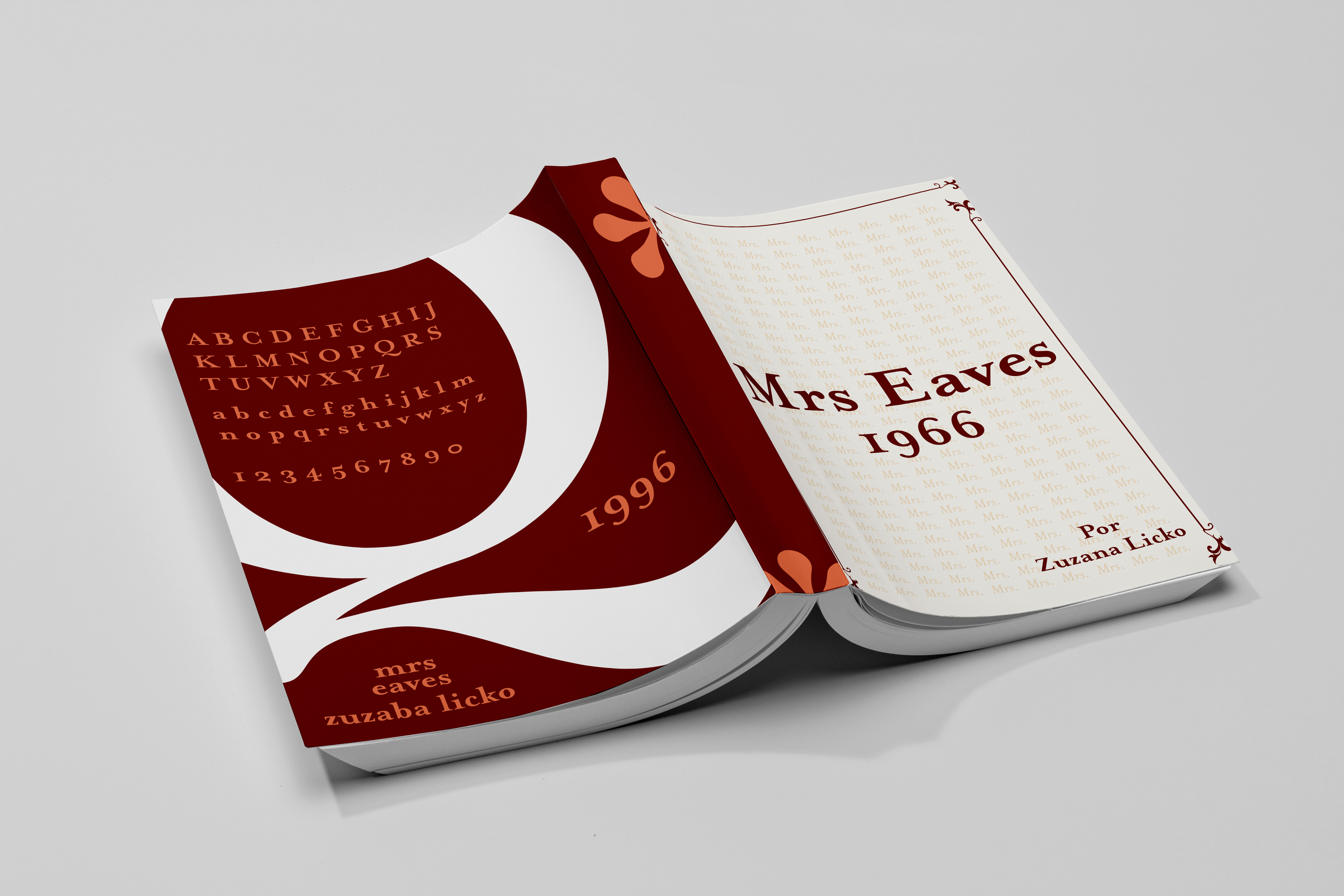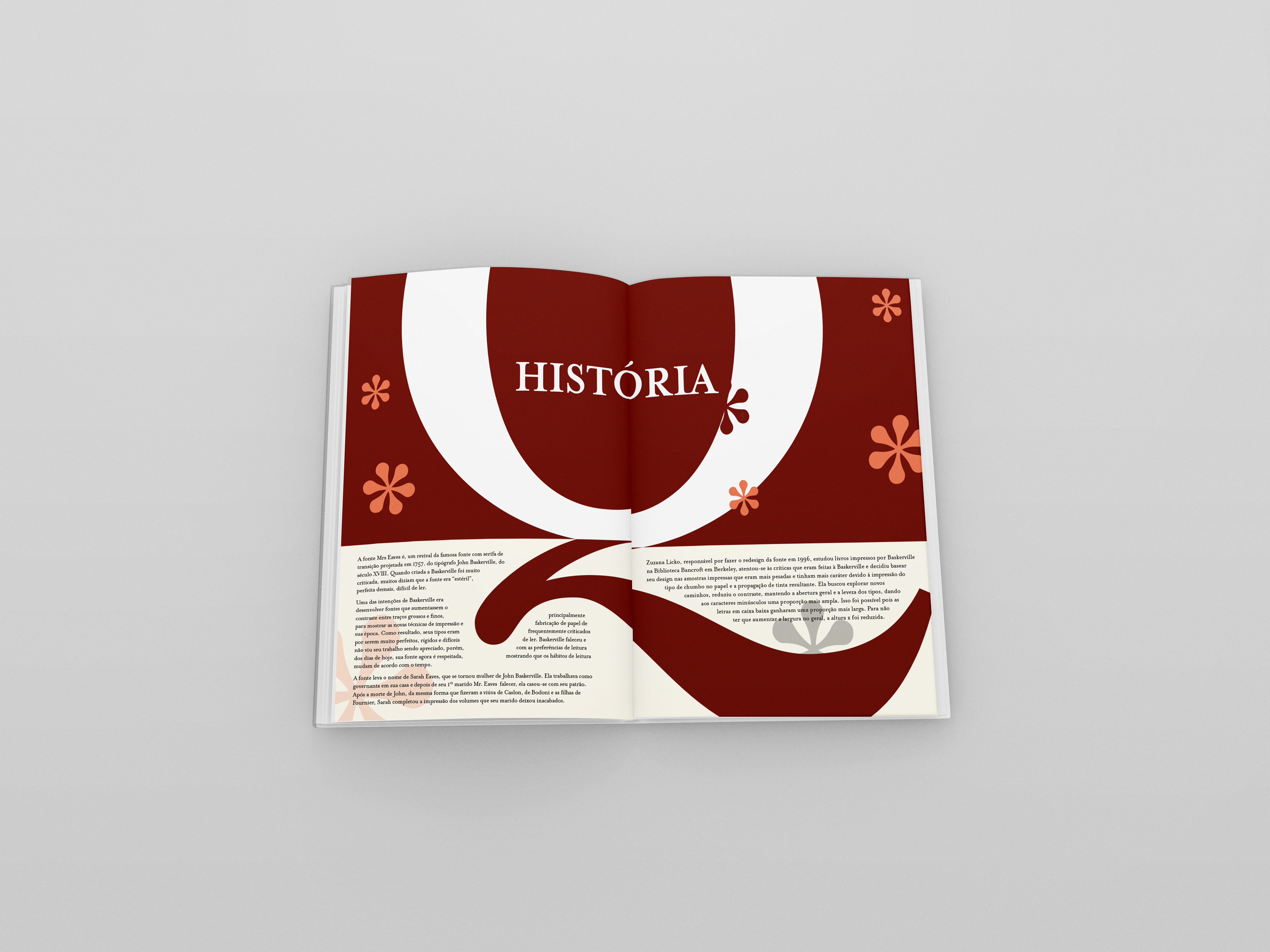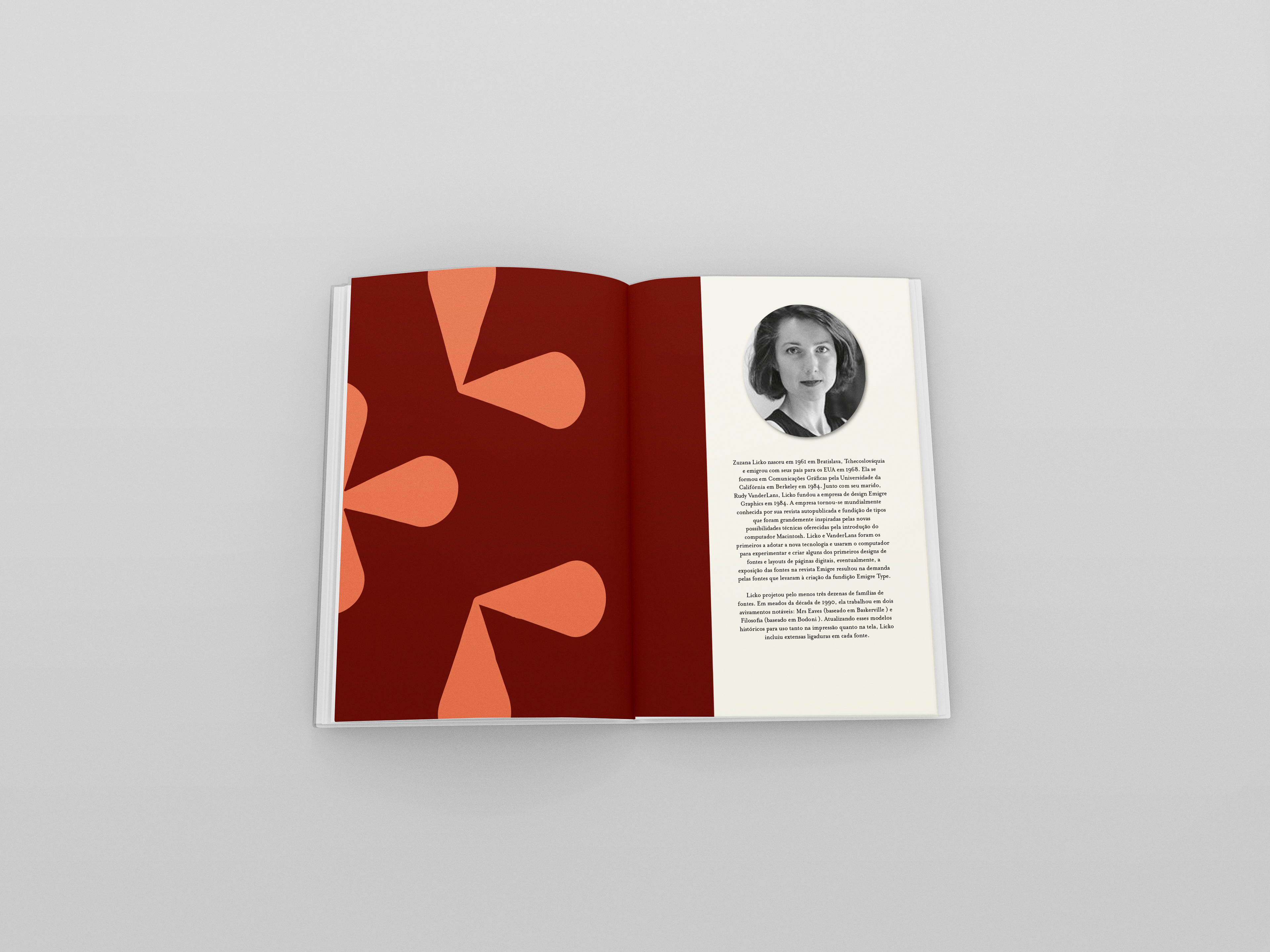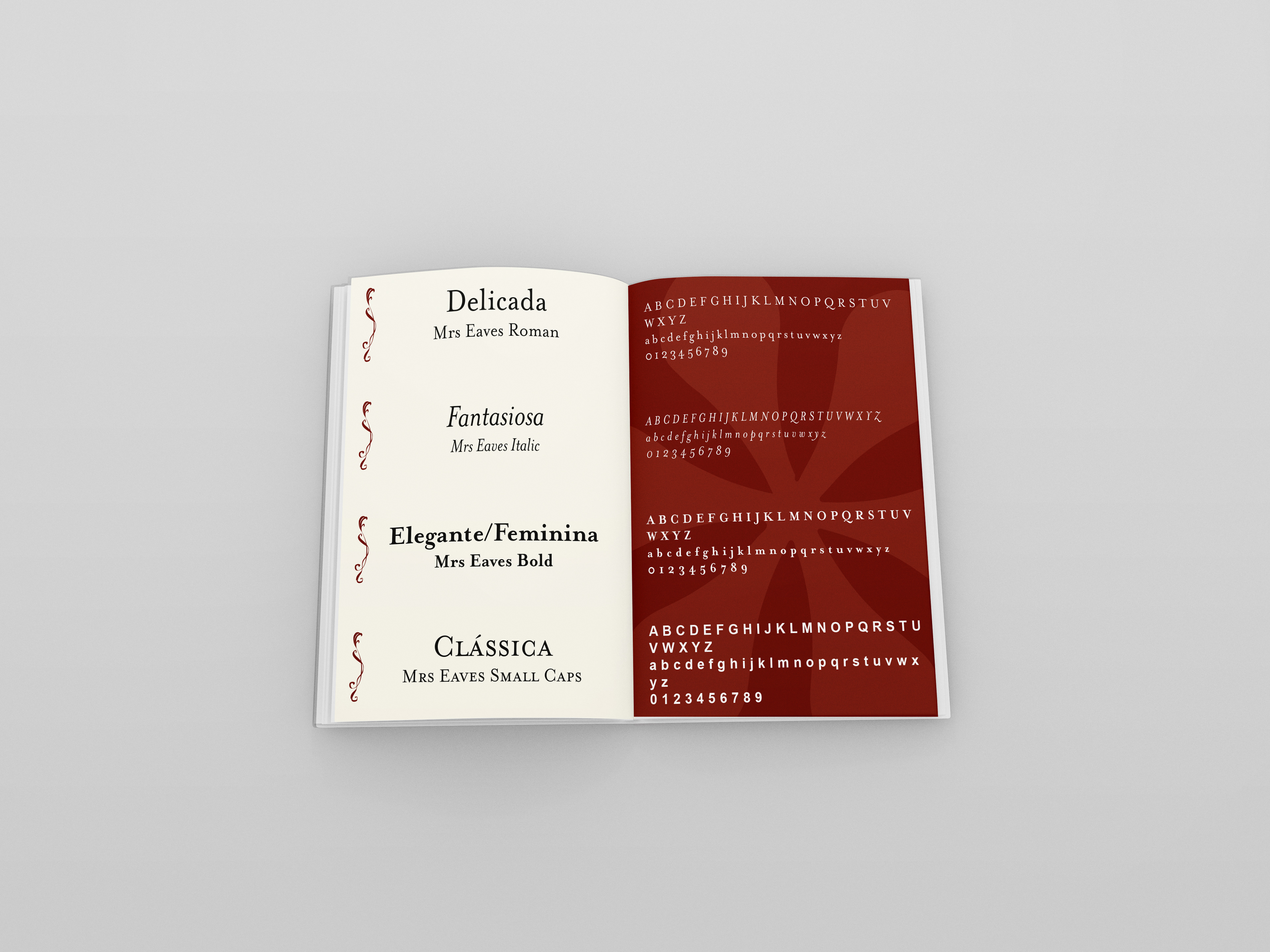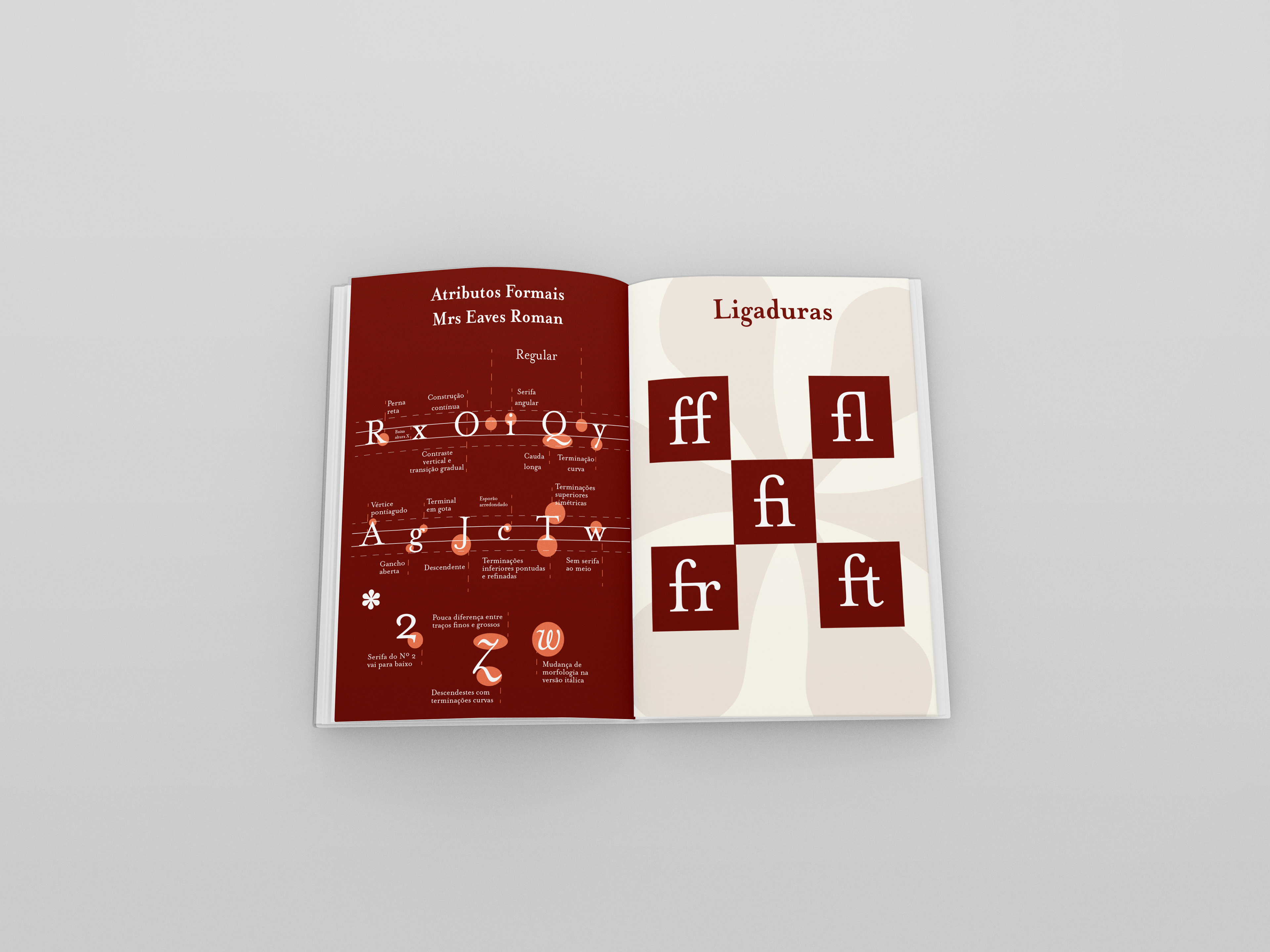
Este projeto foi realizado durante a oficina de tipografia que cursei no meu 5º semestre. Trata-se de um material gráfico que traz uma análise tipográfica da fonte Mrs. Eaves, por meio de sua história e suas características formais. Para a construção deste material, foram utilizadas 2 cores principais, que remetem ao aspecto de elegância e também um elemento da própria fonte, que foi utilizado como um sinal gráfico.
Aqui você pode ver um pouco do meu projeto.
This project was accomplished out during a typography workshop I attended in my 5th semester. It is a graphic material that brings a typographic analysis of the Mrs. Eaves font, through its history and its formal characteristics. For the construction of this material, 2 main colors were used, which refer to the aspect of elegance and also an element of the font itself, which was used as a graphic sign.
Here you can see a little bit of my project.
Mockups: